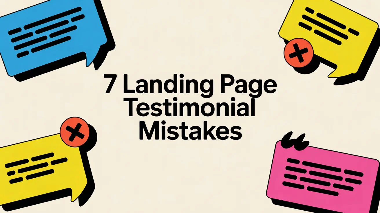
Here are 7 testimonial mistakes that quietly kill conversions for SaaS landing pages. Each one costs sales every day. Most founders make at least 3 of them.
Testimonials build trust fast. Studies show they can lift conversions by 34% or more when done right. But generic or poorly placed ones do the opposite. They make visitors doubt your product and bounce faster.
Having testimonials is not enough. You need specific, credible, strategic ones that match your offer and hit visitors at the right moments.
Mistake 1: Using Vague Testimonials with No Specifics
"Great product!" or "Love this app!" testimonials add zero value. Visitors see them and think, "Okay, but why?" They provide no proof of results.
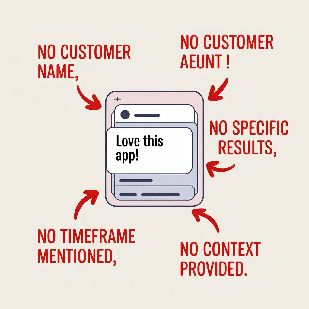
These vague quotes feel fake or forced. They fail to address objections or show real outcomes.
Fix: Collect and use testimonials with concrete details. Include numbers, time saved, revenue gained, or specific problems solved.
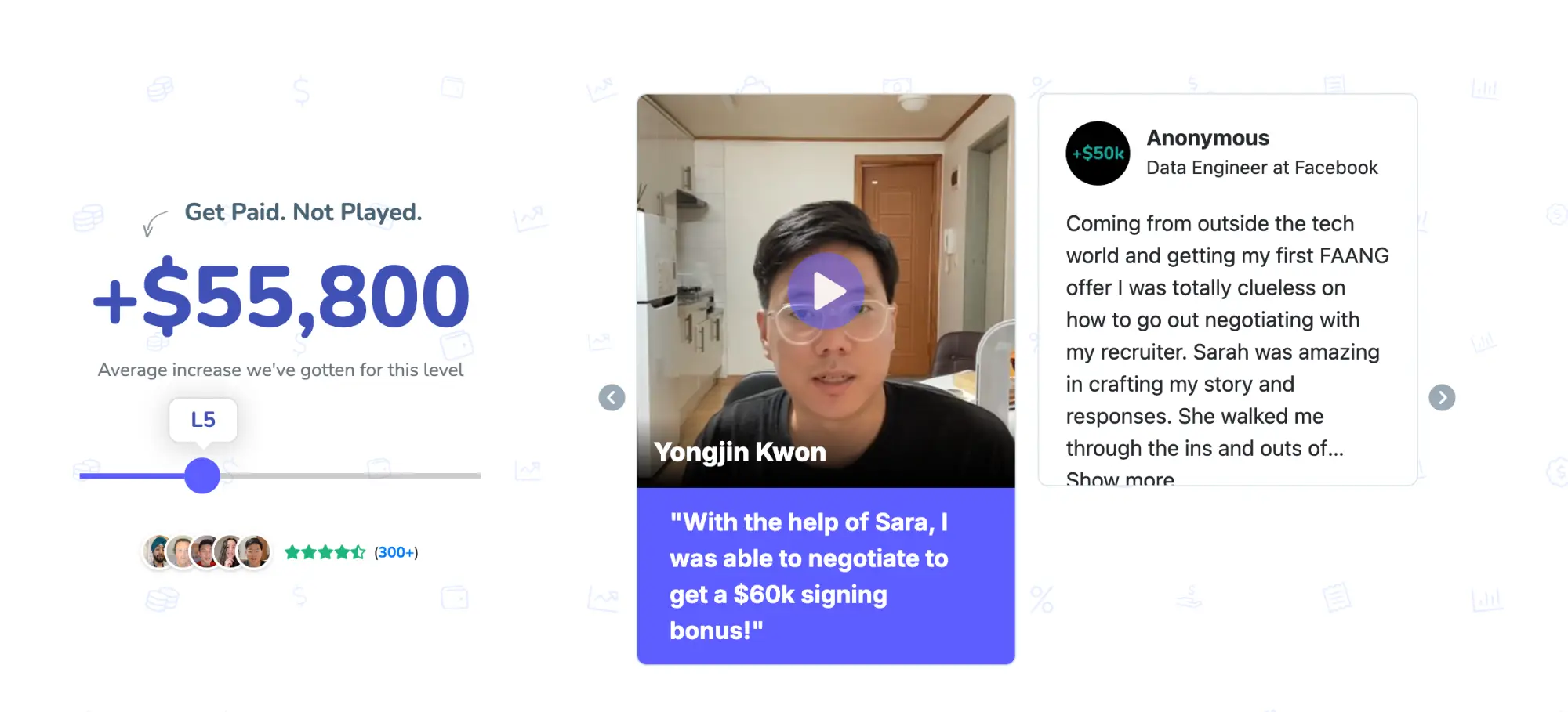
Example of a good one: "Switched from [competitor] and cut our churn by 28% in the first quarter. Support replies in under 2 hours every time." - Sarah Chen, Head of Customer Success at ScaleCo.
This version shows exact impact and builds belief.
Mistake 2: No Photo or Real Name - Anonymous Testimonials Get Ignored
"Anonymous User" or just initials screams fake. People distrust faceless praise. In 2025, visitors expect real humans behind the words.
Without a face and name, trust drops sharply. Studies confirm named, photo-backed testimonials convert better.
Fix: Always include a real photo (headshot preferred), full name, job title, and company. Verify if possible for extra credibility.
Even a LinkedIn-style avatar works better than nothing.
Mistake 3: Burying All Testimonials at the Bottom
Most visitors never scroll past the fold. Placing every testimonial in the footer means 70-80% of traffic never sees them.
Social proof loses power when hidden.
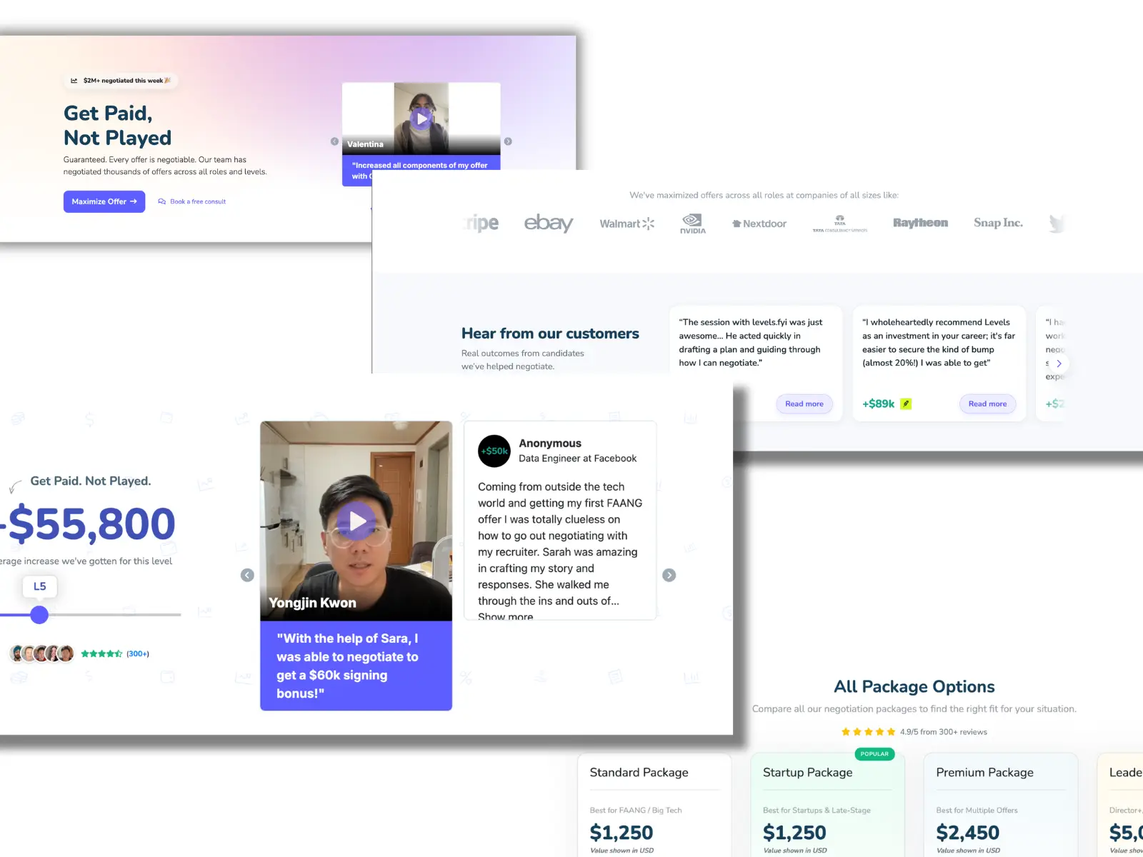
Fix: Scatter testimonials strategically. Put 1-2 strong ones near the hero section or CTA. Add more mid-page where objections arise. Use one right above the buy button.
This keeps proof visible throughout the scroll.
Mistake 4: Sticking to One Format Only
All text testimonials feel flat. All video testimonials slow page load and annoy some visitors.
Single-format sections bore people and miss different preferences.
Fix: Mix formats. Use text for quick reads, short video clips (15-30 seconds) for emotional impact, and logos/ratings for instant credibility.
A balanced section with 60% text, 30% video, 10% logos performs best.
Mistake 5: Testimonials That Do Not Match the Page's Offer
A testimonial about "amazing support" on a pricing page focused on features confuses visitors. Off-topic quotes weaken persuasion.
If your landing page sells a specific plan or feature, mismatched praise hurts.
Fix: Curate testimonials that directly address the offer on that page. For a free trial page, use quotes about easy onboarding. For enterprise plans, highlight ROI and scale.
Segment your testimonial library by use case.
Mistake 6: Never Updating Testimonials - Stale Ones Raise Red Flags
A 2022 testimonial in 2026 looks suspicious. Visitors notice dates and wonder if the product still delivers.
Outdated quotes signal neglect.
Fix: Refresh testimonials every 3-6 months. Rotate in fresh ones with recent dates. Remove anything older than 18-24 months unless timeless.
Show "As of March 2026" on key sections if needed.
Mistake 7: Creating Walls of Love with No Hierarchy
A giant block of 20 identical-looking quotes overwhelms. Visitors skim and retain nothing. No standout element means no impact.
Fix: Create visual hierarchy. Pull out 1-3 hero quotes in larger font with big pull quotes. Group the rest in a carousel or grid. Use different formats and lengths to break monotony.
Highlight results with bold numbers. For example: "Increased MRR 42% in 4 months"
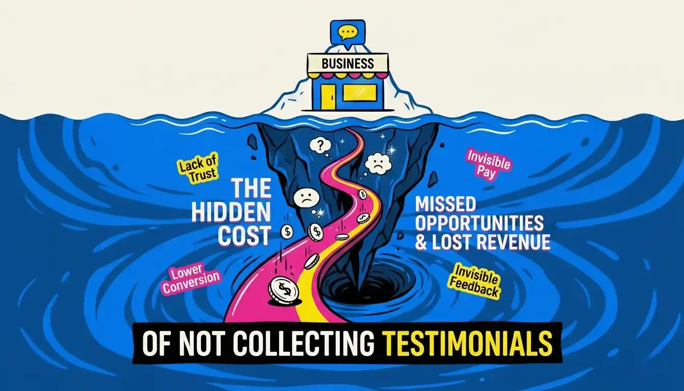
Stop Leaving Conversions on the Table
Testimonials are one of the highest-leverage elements on your landing page. Get them right and they do the selling for you. Get them wrong and they quietly erode the trust you have worked to build.
The mistakes above are not rare. They are everywhere. Most landing pages have at least three of them.
VouchView makes sure every testimonial you collect is structured to avoid every mistake above. Try it free.